I recently moved from the Bay Area and am currently working
with the UX Design Team at Bank of America in Charlotte, NC.
- — - — -
I have freelanced for various Bay Area ad agencies and
digital shops since 2012, with extended stints at Organic SF,
R/GA, Pereira & O'Dell, and Duncan/Channon.
Prior to that, I was a Senior Designer at Pereira & O'Dell.
Previous agencies include Goodby, Silverstein & Partners in
San Francisco and McKinney in Durham, North Carolina.
- — - — -
Download my resumé or check me out
on LinkedIn or WnotW for availability.
For full contact information, download my vcard or e-mail me.

Daily Change's goal is to gradually help ease customers who may not make the best financial decisions into the habit of saving money. By giving customers short term challenges as well as longer term savings goals, they can take better control of their financial health by making regular deposits into their growing savings.
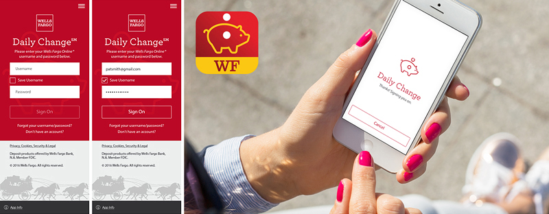
Wells Fargo customers must first set up two accounts — a checking and a savings. After downloading and signing into the Daily Change app, users can create a savings "Challenge" with a short-term deadline, create a longer term "Goal," or simply make a direct transfer into savings at their leisure.
Through these small but repetitive transfers, Wells Fargo customers create new spending patterns by tracking their savings over short sprints, learning the ease of saving through small amounts (spread out over time), and by forming new saving habits in their daily lives.
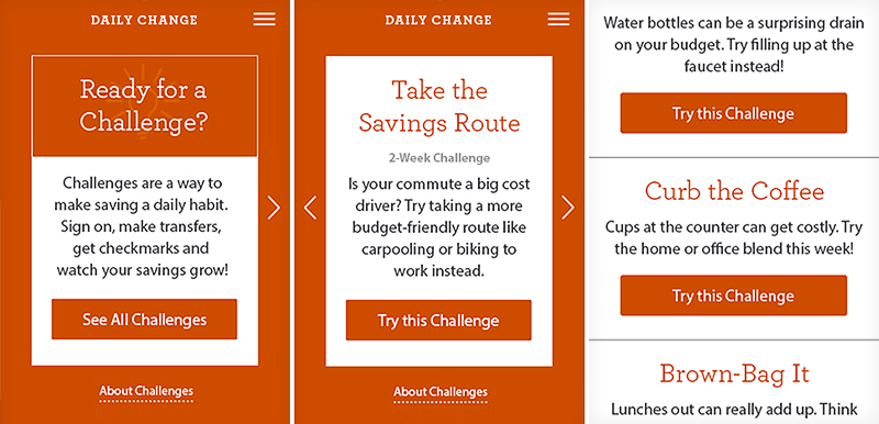
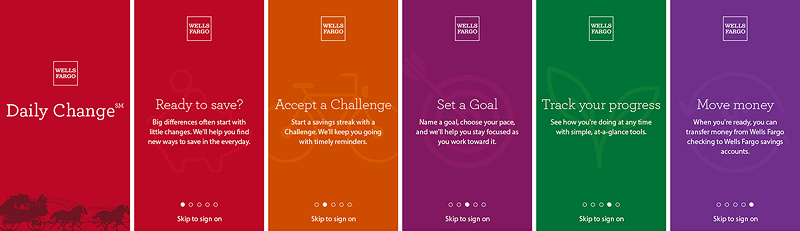
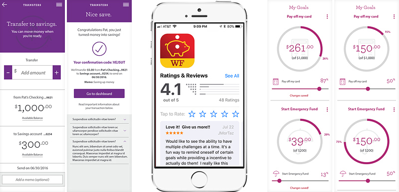
Challenges teach WF customers by starting with simpler tasks — like bringing their lunch for a week or reducing their commute costs through alternative means. Push notifications remind the customer to make their daily transfer, and they are rewarded with notifications once the transfers have been successfully made. Their balance fluctuates accordingly on the dashboard, keeping users notified of their progress.
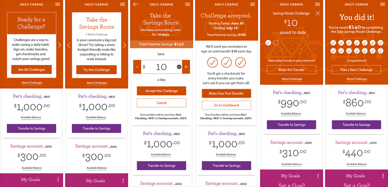
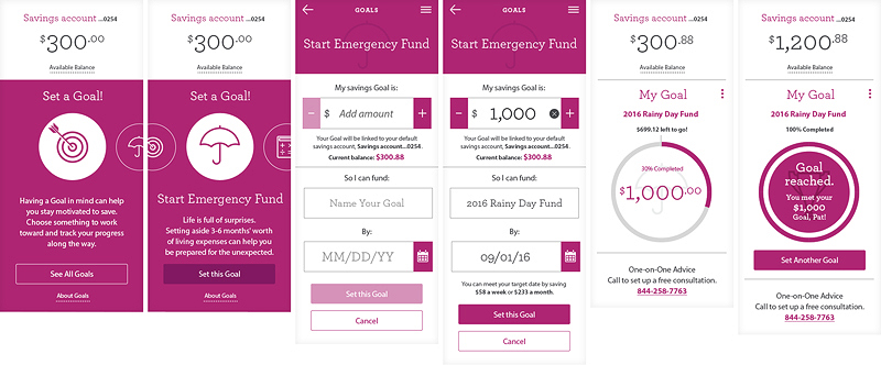
Goals rely on the customer creating smaller savings goals and setting a reasonable deadline for completion, which is the more self-initiated alternative to Challenges. As their savings account balance grows, the closer they get to the Goal.
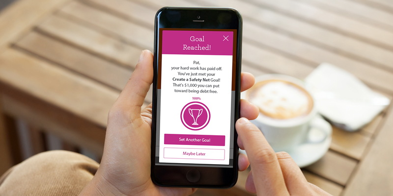
The app tracks and sends reminders on a schedule to let the customer know how much is needed to reach their savings goal. Pop-up messaging alerts appear to congratulate Goals being met.
Daily Change was released to positive app store reviews and a 4.5 star review on iTunes App Store and a 4.2 on GooglePlay. (It currently holds a 4.1 rating after 12 months on the market.) Agency: Organic-SF; AD-VD: Samantha Li / Matt Courtney, UX: Ross Fischer, CW: Emily Chan, CD: Zoe Munson / Mark Shewmaker
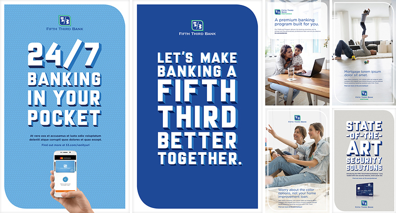
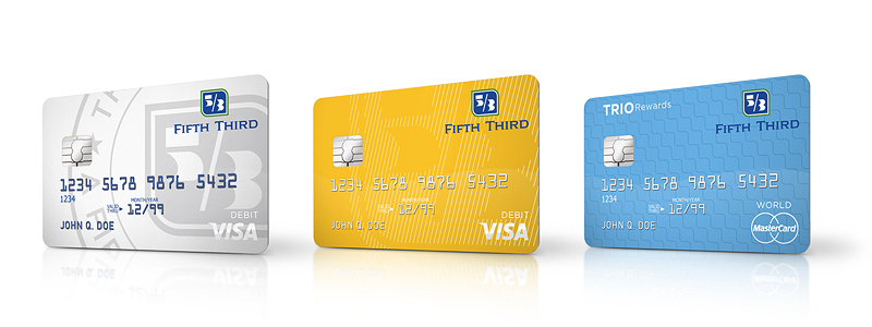
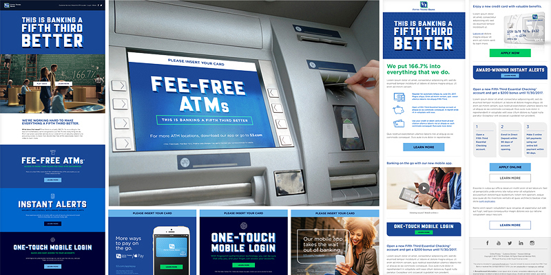
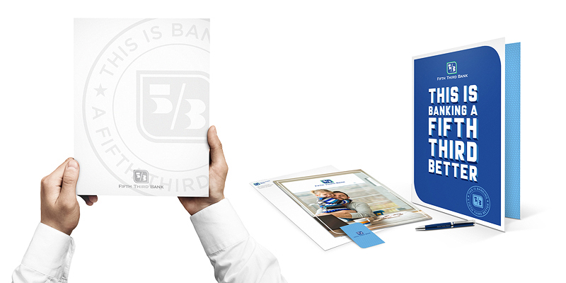
Fifth Third launched a brand refresh in 2017 to coincide with their advertising campaign created by Pereira & O'Dell. I was brought in to assist the design team in defining, expanding, and refining the brand guidelines for national use. Additionally, our team created hundreds of elements ranging from in-store displays and collateral to ATM screens and additional digital layouts. Design Director: Moses Kelany
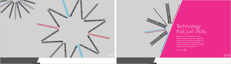
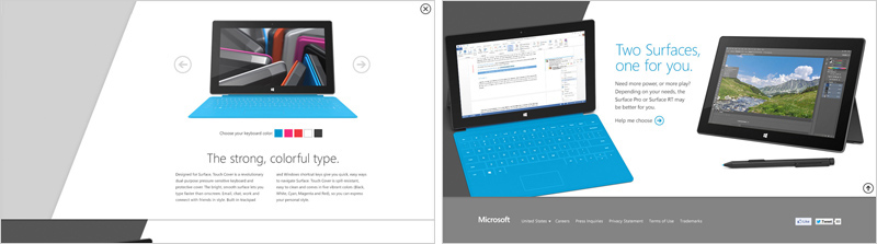
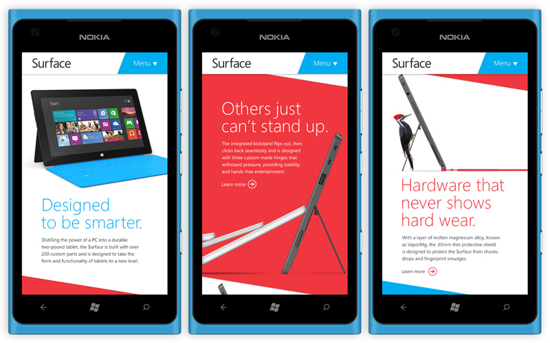
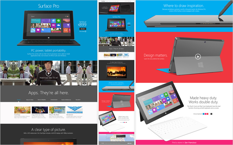
My team at R/GA was tasked to help launch the Surface Pro for Microsoft in 2013. We completely redesigned the responsive website to showcase the tablet/computer hybrid, with mobile/tablet browsing heavily influencing the layout and functionality. We also created animated featurettes that could be used as digital ads to drive traffic to the site via social and mobile channels. The Surface RT and Surface Pro both came with all-new features that separated them from the competition, and a fundamental goal of the site was to help customers compare which version was right for them in clever, playful ways. Copywriter: Angie Ogburn
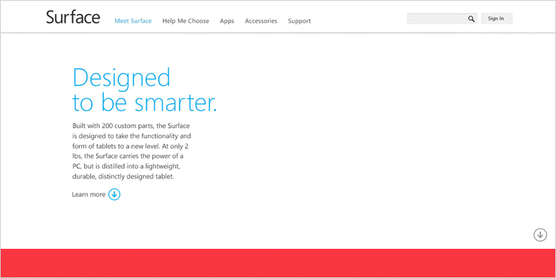
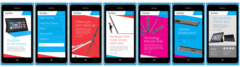
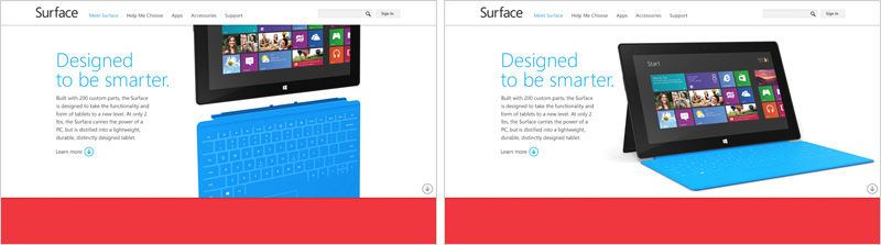

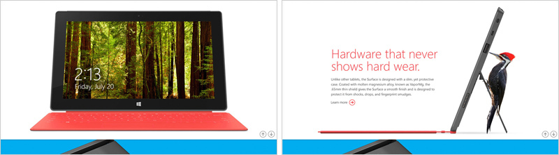
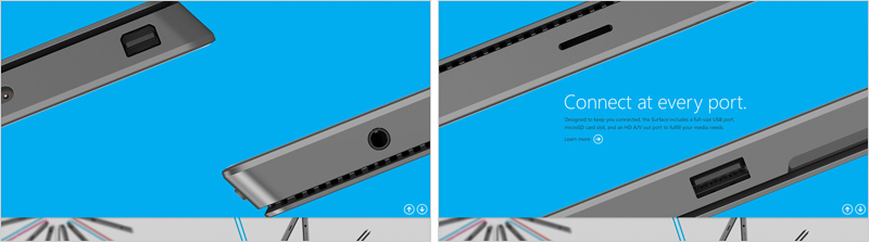
We rapid-prototyped the site with R/GA's talented developers utilizing HTML5 and video elements for both desktop and mobile. The responsive design guaranteed that users would always be delivered the optimized version of the experience for their device without losing any content or functionality—including video components.
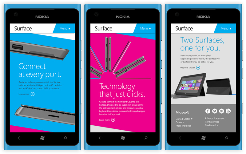
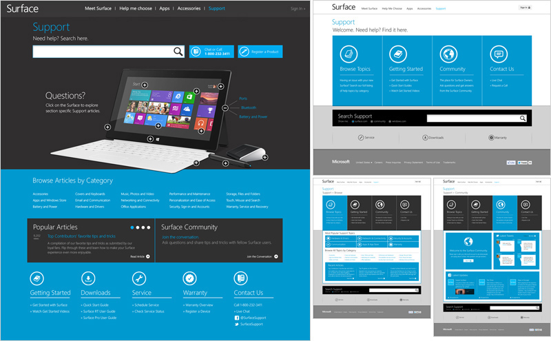
A secondary part of the project was delivering additional concepts for the site plus exploration of the Customer Support section which would be implemented later in the launch (to be handed off to the client for final development). This part of the project obviously included less-refined iterations, but allowed us to explore some broader interesting ideas.
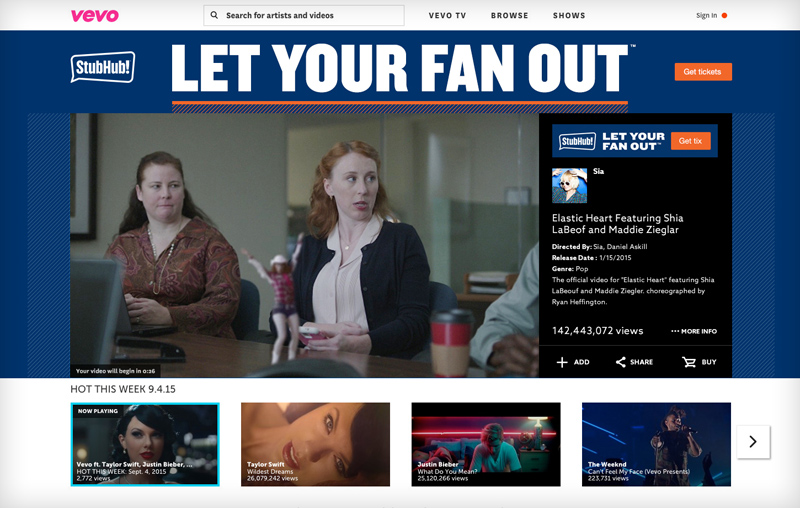
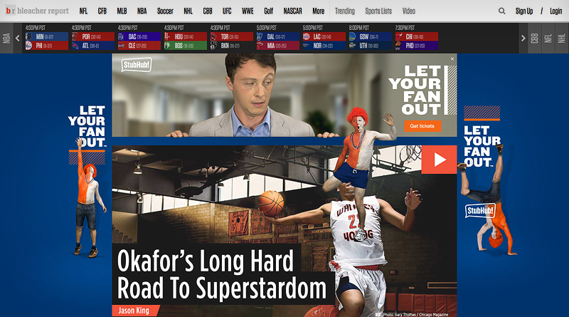
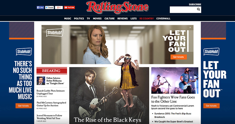
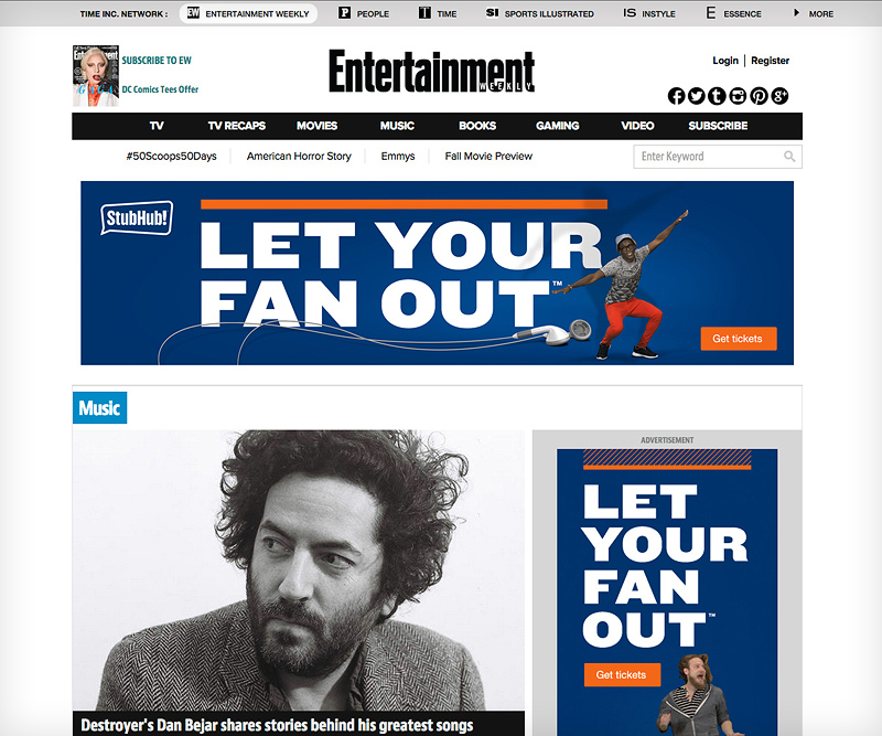
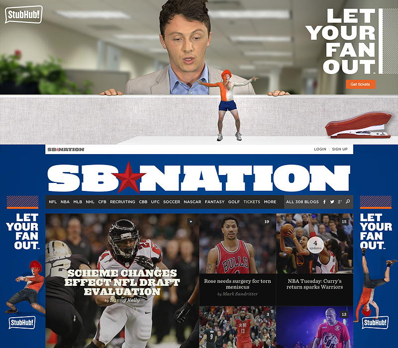
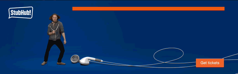
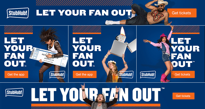
Duncan/Channon created several television spots for StubHub that ran on a range of sports and entertainment channels. My digital team was tasked with carrying the campaign into the digital realm and translating the scale and frenetic charm of the "crazed inner fan" from television, oftentimes without the use of audio. Several challenges arose, from a platform-wide switch from traditional Flash banners to HTML5, to the client wanting video assets that reflected the energy of the campaign. A two-day green screen shoot resulted in hours of video and stills that we crafted into our high-energy digital campaign.


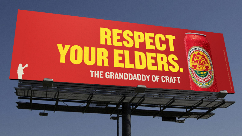
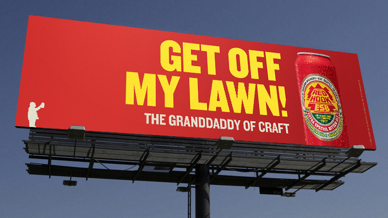
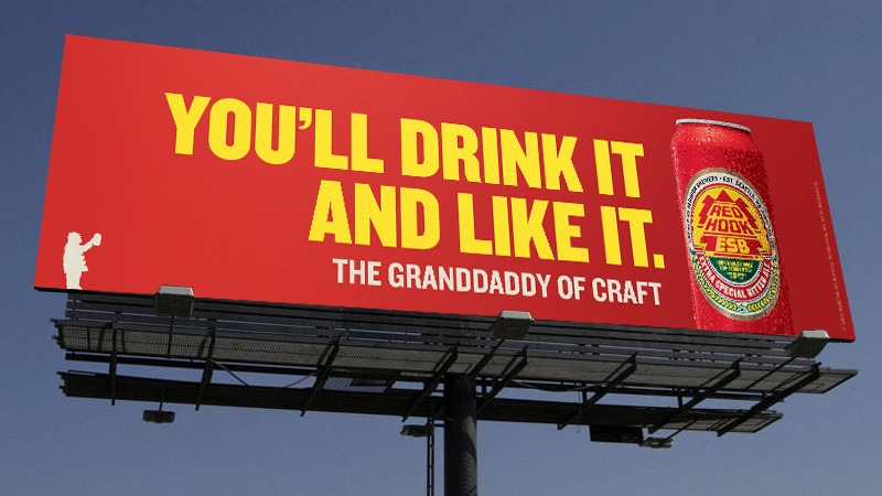
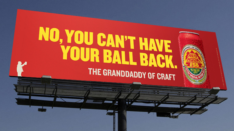
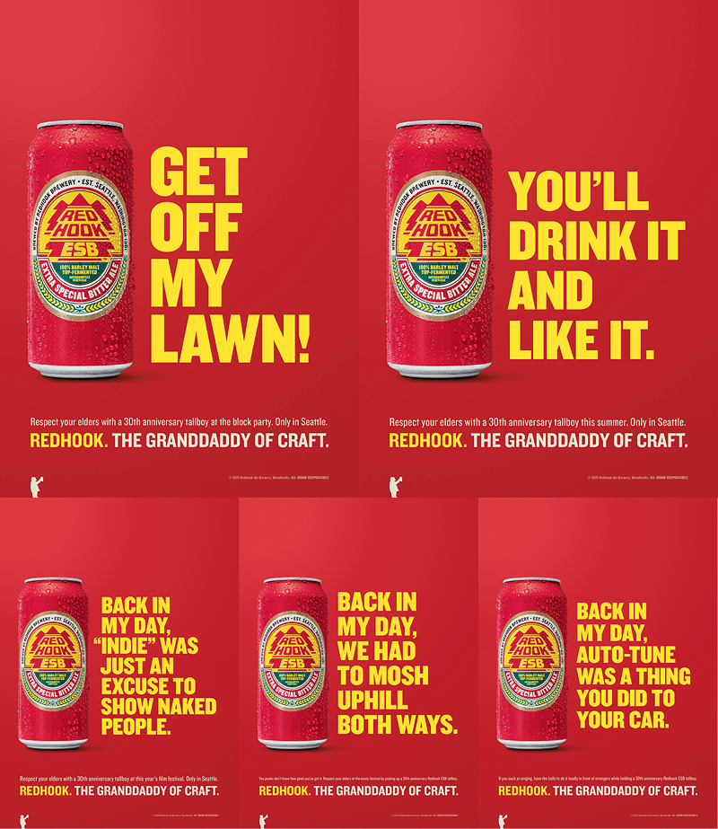
The Craft Brew Alliance entrusted Duncan/Channon with creating a campaign for the local Seattle market for the 30th Anniversary launch of their new retro tallboy can for RedHook ESB, their flagship beer. Channeling our inner grumpy old man, our team brought to life "The Granddaddy of Craft" in out-of-home, print, digital, and radio. The campaign continued into 2016 in the beer's hometown Seattle. Copywriter: Derek Taylor


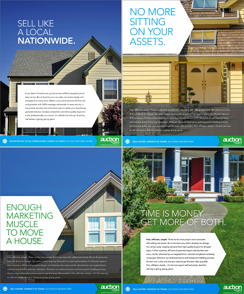
Auction.com, a pioneer in the online real estate market, came to us in 2014 to revise their brand and give them a voice in online and print. The largest challenge was simply streamlining their look and feel across multiple markets, and synchronizing their tone and photographic style. Agency: Duncan/Channon
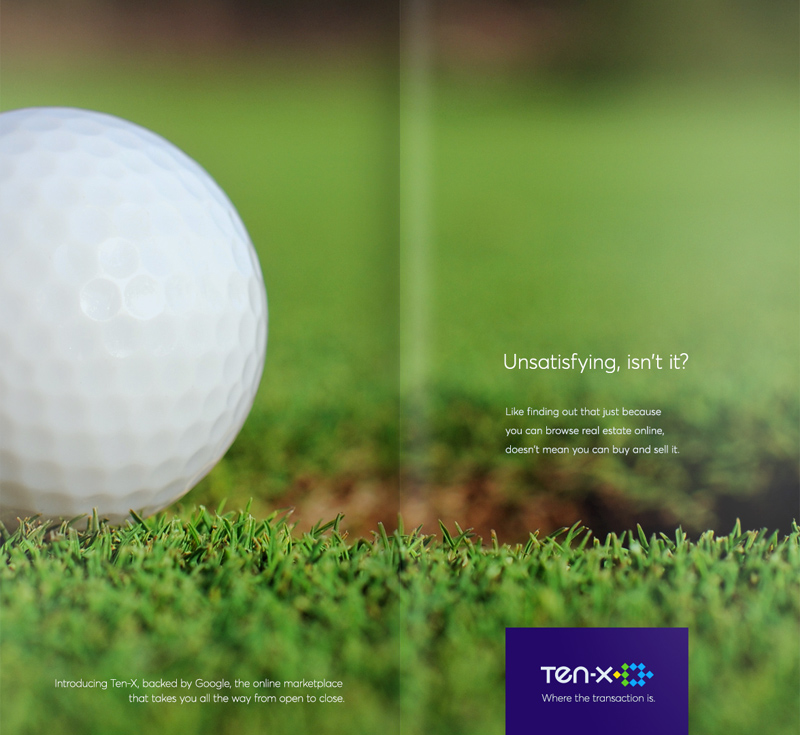
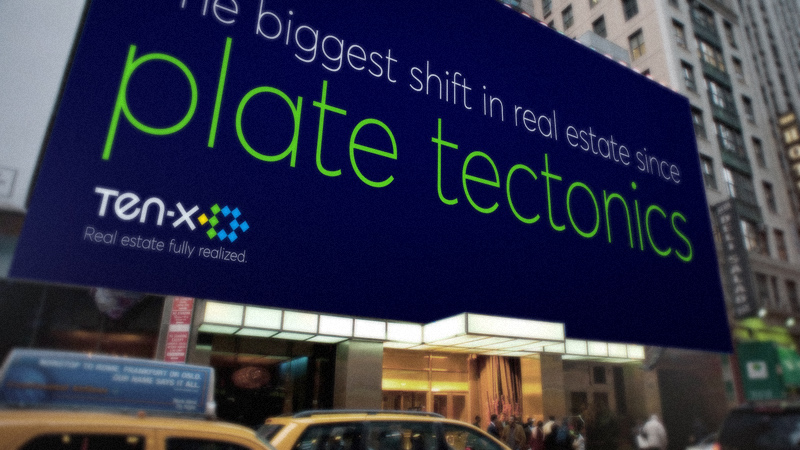
Pleased with our work the previous year, Auction.com restructured into their retail offerings under a new company they named "Ten-X", which focused their sales on commercial and residential (leaving behind the auction format for their parent company). Below are various campaign executions for Wall Street Journal spreads and out-of-home placements for 2015-2016.


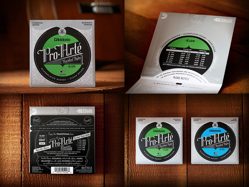
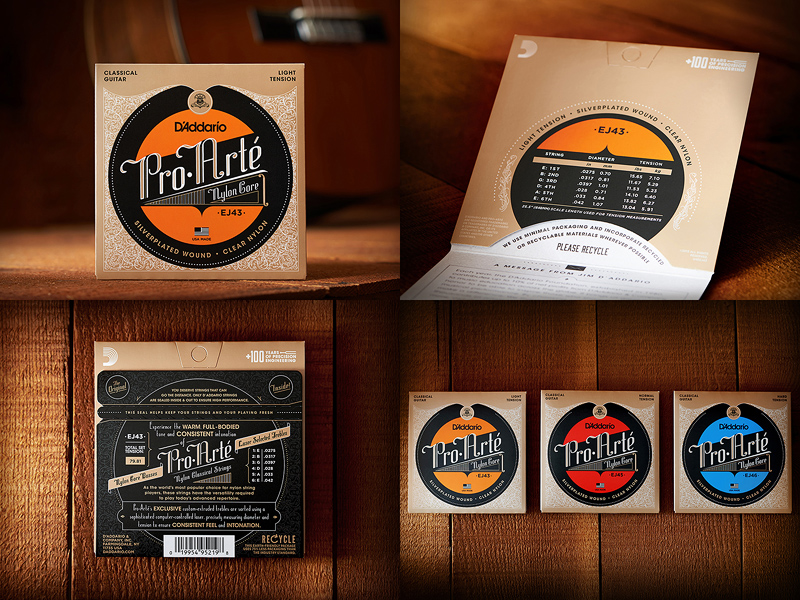
David Hermanas and I partnered together on the packaging design of various instrument strings for this classic American music brand.
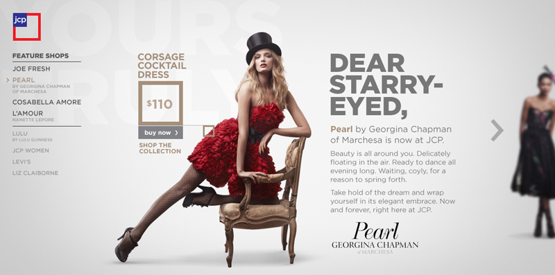
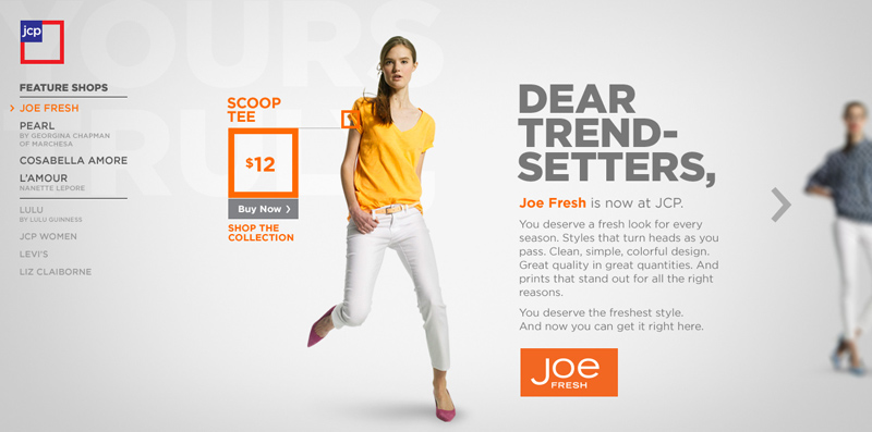
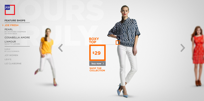
R/GA was tapped by JCPenney to relaunch their site after internally revamping their brand and bringing a new collection of fashion brands into the fold. The responsive site design included the ability to expand new brands/designers and update product listings as they cycled in and out. The site and campaign launched in conjunction with the 2013 Oscars.
Duncan/Channon created this campaign to break into a bigger market and unify their brand. Work included mixed digital, print, and radio.

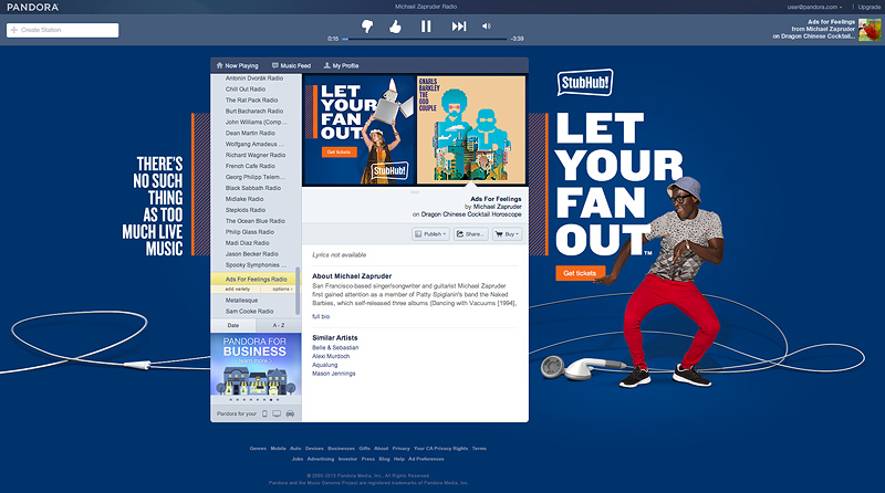
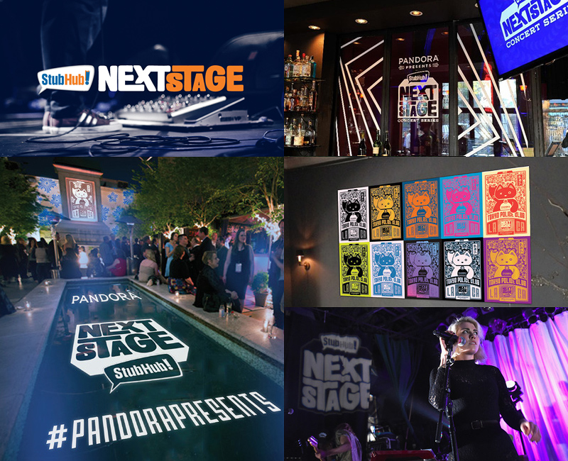
Duncan/Channon branded this ongoing music series for StubHub's partnership with Pandora. It launched in the spring of 2014.
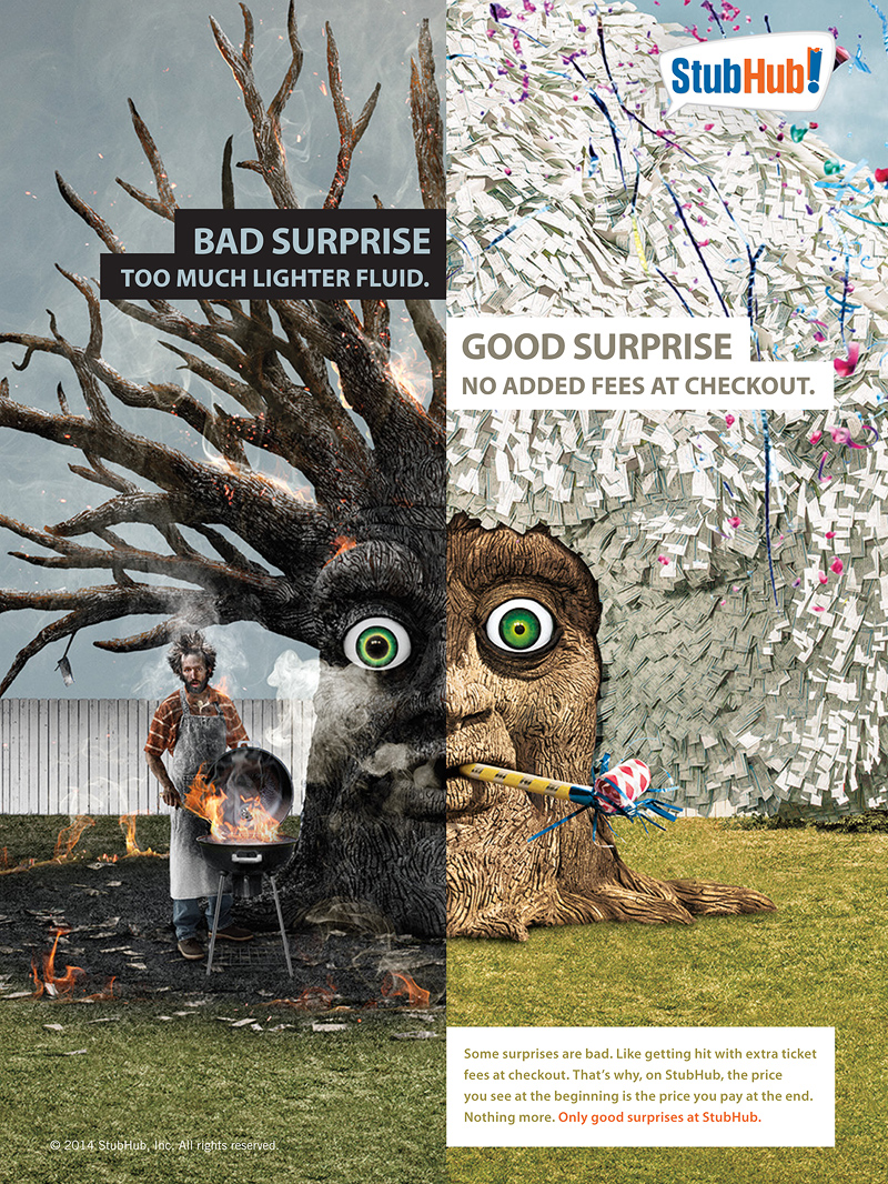
Duncan/Channon created the "Only Good Surprises" campaign for StubHub's sports and music events including print, digital, tv, and radio.
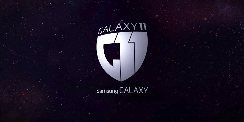
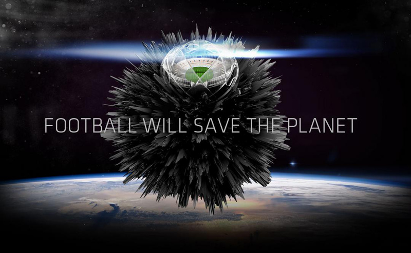
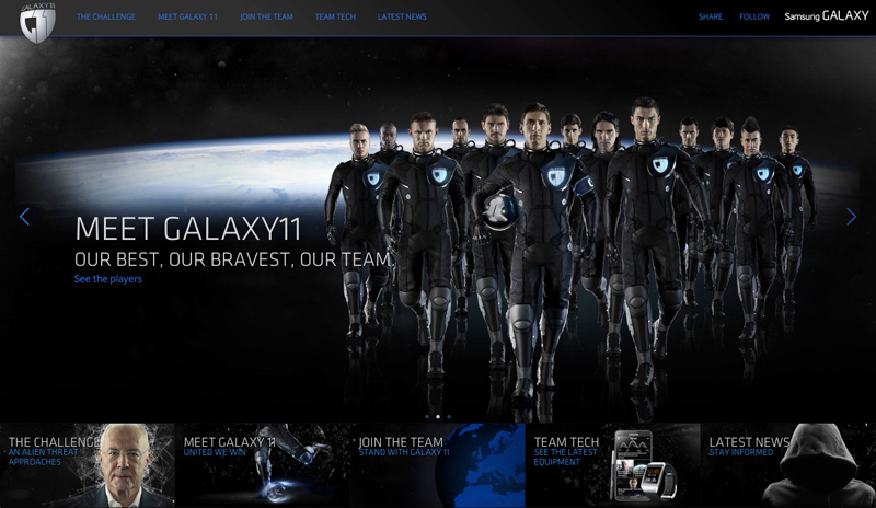
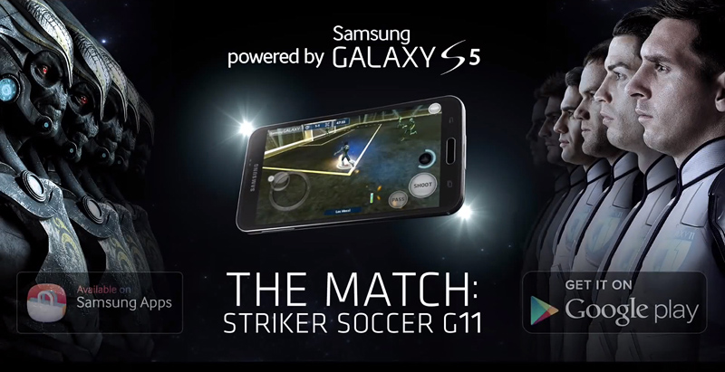
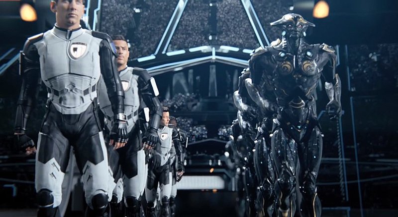
R/GA created this extensive integrated campaign for Samsung that ran for almost a year from 2013-2014, leading up to the 2014 World Cup. The work was a huge collaboration between two agencies and many revolving teams and intertwining projects that pitted 13 international soccer stars against an incoming alien invasion, united as one planet with the help of our love of football. The work included everything from stunts and OOH to microsites, online video, games, and various social media sites with the cooperation of a whole slew of world-class athletes.
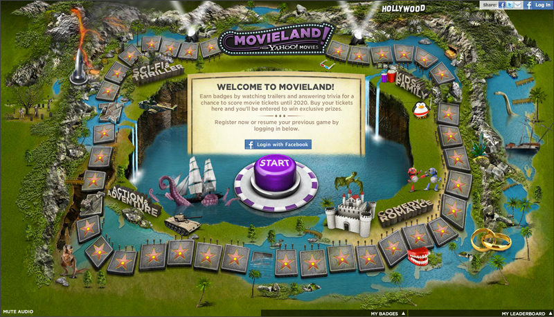
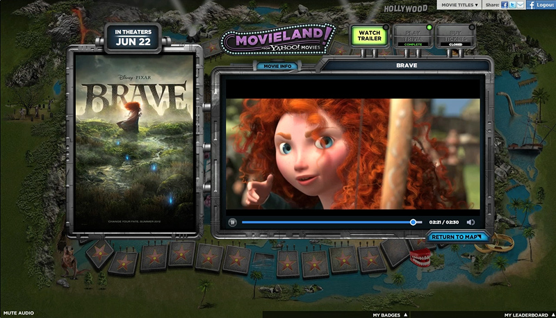
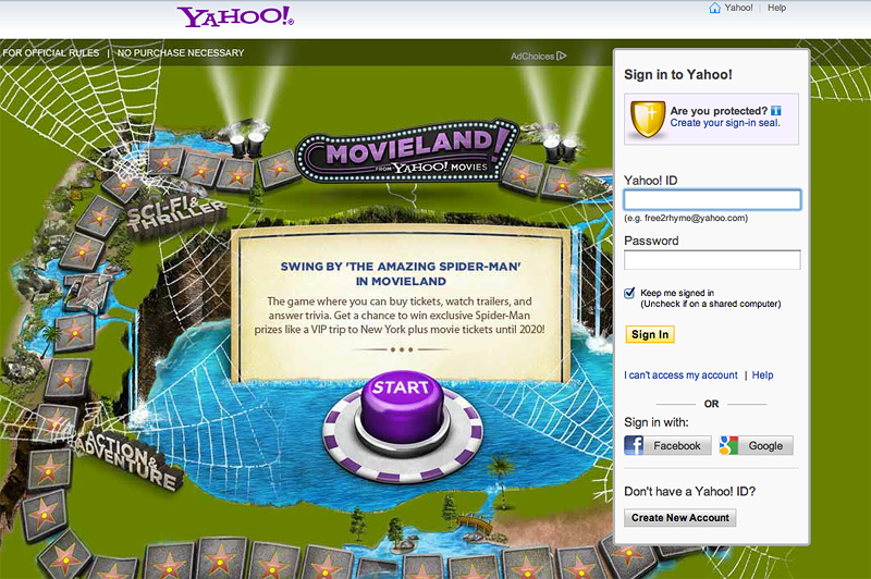
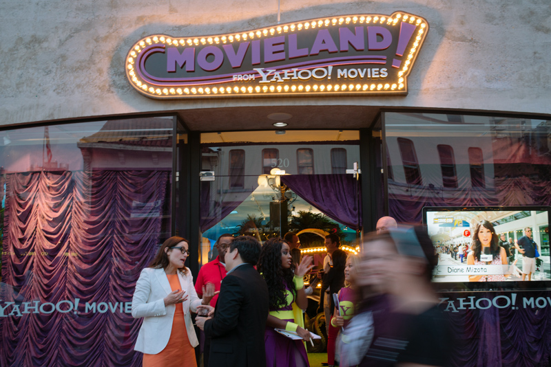
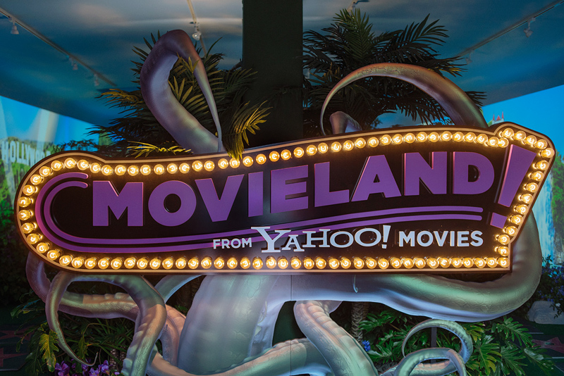
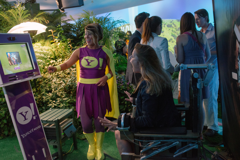
Yahoo! Movieland is the summer movie-goer's one-stop destination for movie trailers, info, buying tickets and a chance to win studio-sponsored prizes all summer long. Presented as an interactive board game, users can complete the board tiles and compete for top placement. Connected through Facebook, users can share with friends and strangers alike. In addition to the microsite, a banner campaign and installation for Comic-Con 2012 were developed to tie into the summer movie season. Agency: Pereira & O'Dell
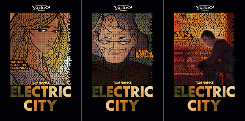
Tom Hanks' web series "Electric City" was hyped by the mysterious code-breaking campaign at TapJoint.com (case study link—site is no longer live) which used story-specific encrypted messaging (sent in an audible fashion similar to morse code) to lure fans into the animated world of the show. Users created their own wiki site, tweeted, and shared codes to unlock content and get a sneak peek at the series before the launch. For more on the site, check out the case study or this brief feature from Fast Company for more info. Agency: Pereira & O'Dell; Creative Team: Keli Linehan (AD), Charlie Wolff (CW).
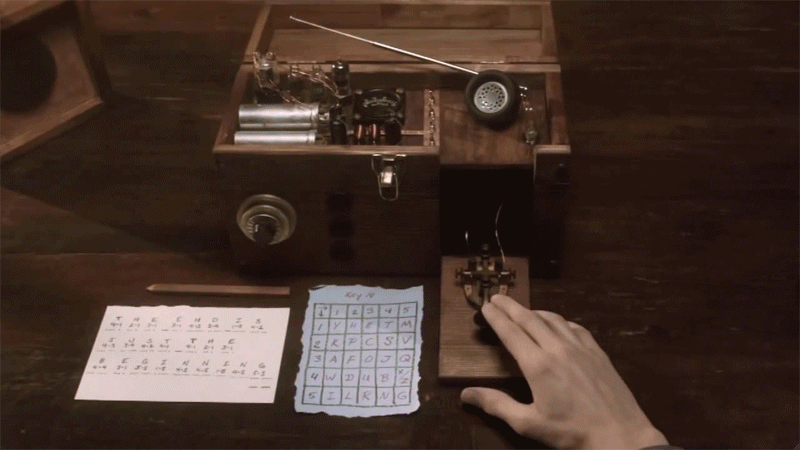
Posters for the launch were distributed at events such as CES and SXSW, with some containing encoded messages. Paired with the proper key, the dot design in the posters revealed information that drove the more clever viewers to the site, to unlock more content. The biggest challenge came from translating the secret audio code from the web series to a silent, visible one that could be used in mobile, social, and print. I helped the team develop the visual language and puzzle system used in everything from posters to banners. We drove over 1M page views to a the mysterious microsite where returning users spent (on average) almost 30 minutes deciphering clues each visit.
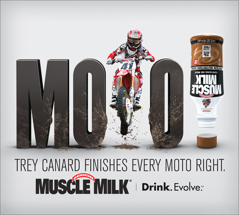
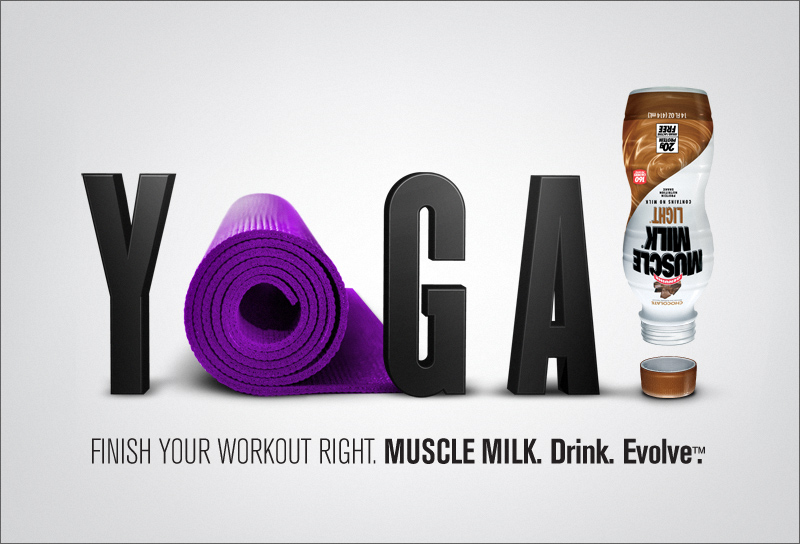
Muscle Milk let us take their visual style in a new direction for 2012. In a field dominated by complicated backgrounds and explosions and lightning, we took a simpler route with a clean background, featuring athletes as part of a bold, single-word statement. The up-turned, "finished" bottle punctuated the action statement with the tagline "FINISH YOUR WORKOUT RIGHT. MUSCLE MILK." Agency: Pereira & O'Dell; Creative Team: Keli Linehan (AD), Charlie Wolff (CW).
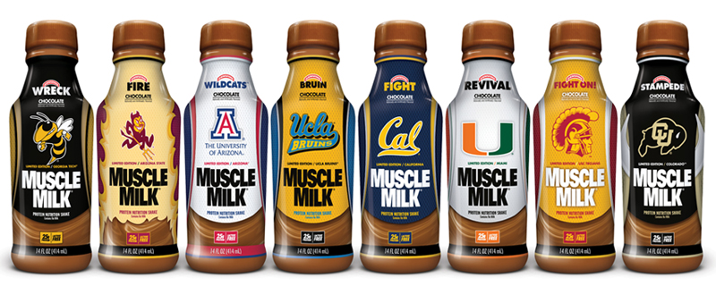
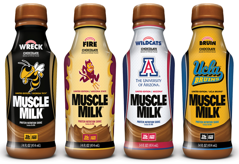
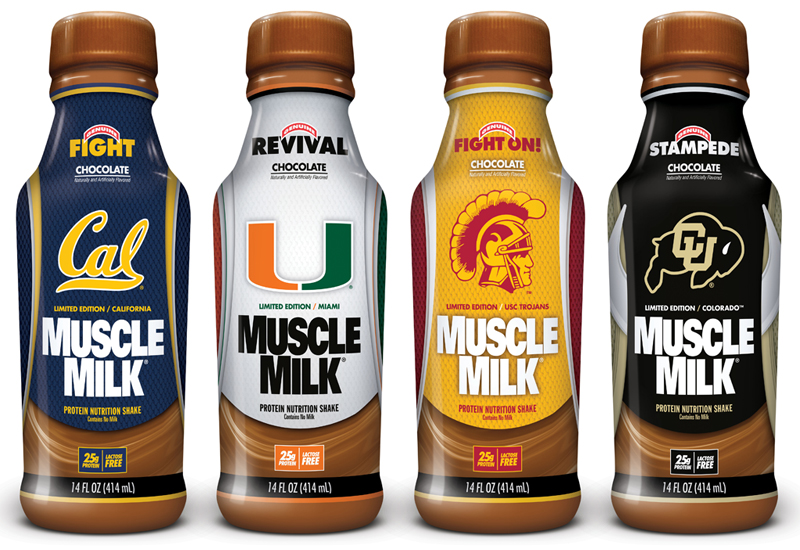
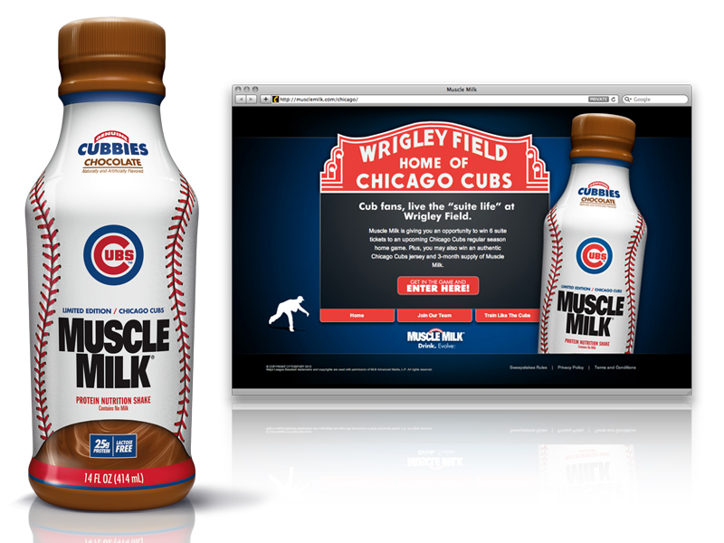
Muscle Milk created limited-edition bottles for an extensive selection of NCAA colleges for 2010. Bottles were distributed regionally to each school and ads ran in out-of-home and also in point-of-sale locations featuring the bottles.
The Cubs Limited Edition bottle was distributed in the Chicago area and at games, and a microsite was created to sponsor the sweepstakes.
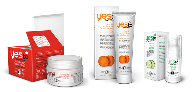
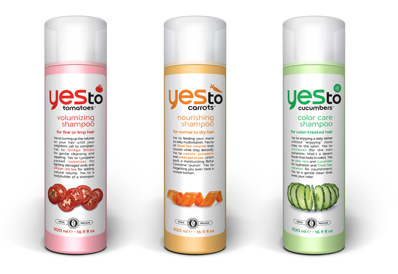
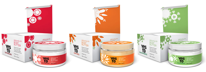
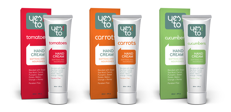
Yes To™ is a beauty product line based out of San Francisco. Originally started as an environmentally friendly line of carrot-based products, their offerings quickly expanded to cucumber, tomatoes, and even a baby line of products within a very short timeframe. Since their products had evolved and grown at such a fast pace, they required a rebrand to streamline their wide selection of products and organize their various sub-brands under a revised parent company. Our design team at Pereira & O'Dell worked with the clients to rework their brand from the ground up, creating a parent brand and the various sub-brands, and introduced new typography and photography to work with their existing color palette and personality.


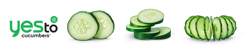
During our time with Yes To™, we redesigned over 80 separate products, ranging from lip balms and facial lotions to body wash and hair-care products. Below is a very small sampling of the wide range of items redesigned over the 8-month project span. In addition to the 3 main sublines (Yes to Carrots, Yes to Cucumbers, and Yes to Tomatoes), we helped Yes To™ launch their baby care line, Yes to Baby Carrots.
Not everything always makes the final cut. Below are some alternate concepts in the early phases of the Yes To™ rebrand that later had elements incorporated into the final designs.


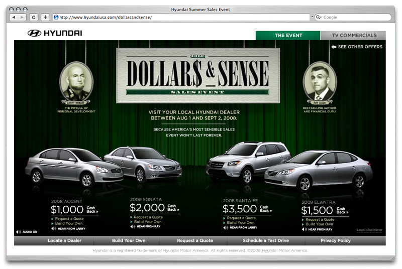
LAUNCH ARCHIVED SITE — Online portion of Hyundai's Dollars & Sense Summer 2008 campaign. Microsite and extensive banner campaign consisting of rich media units, online "interstitial" video banners and video clips. Agency: Goodby, Silverstein & Partners
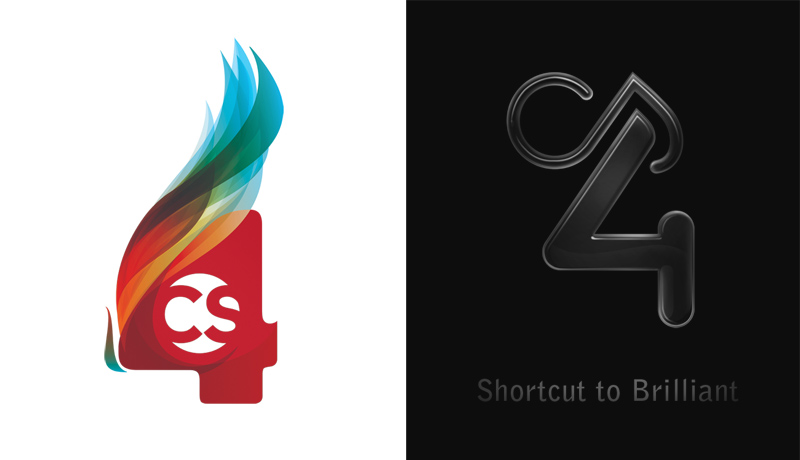
The thing I admired about Adobe agreeing to the approach of the CS4 “badge” was their willingness to brand their latest platform of software by not branding it with a typical logo. The CS4 badge reflects the diversity of its software and the beautiful (and in some cases, simply raw) things made with them. Below are the “hero” badges Adobe used for more corporate promotional items and in the unveiling of CS4. Various other logos were created by designers to go along with their showcased designs in varying print and broadcase pieces. Playful, raw, experimental, and ever-changing. Agency: GS&P
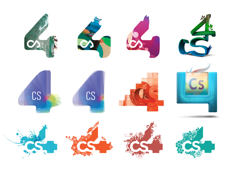
As always, there are some various experiments that don't quite make the cut, but were some interesting explorations nonetheless:
2008 campaign for the non-profit fundraiser in Durham, NC. Sponsored by McKinney and other North Carolina businesses. These little business rockers were scattered around Durham as a teaser with the web address stamped on the bottom. Other elements involved site design and additional promotional elements for the event. Agency: McKinney


2007 Campaign concepts for Audi's flagship race-inspired models ('08 TT and R8 Models). Agency: McKinney


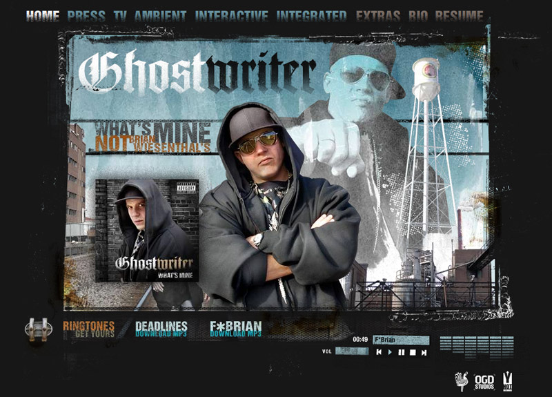
THEREALCOPYWRITER.COM was shortlisted at the 2007 Cannes Cyber Lions. See the shortlist here. It is the portfolio of copywriter Brian Wiesenthal. The project was completed on a freelance basis through OGD in collaboration with Brian and photographer Luis Erazo. Parental Advisory Suggested.
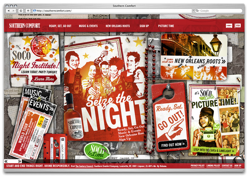
Bottle designs to update the brand while keeping the heritage of its New Orleans roots intact. Agency: McKinney

LAUNCH ARCHIVED SITE* — This was the corporate site for SoCo which was live for nearly 4 years from 2007 to mid-2010.
*NOTE: Due to Flash no longer being supported by Adobe or many browsers, I cannot guarantee that this plays anymore. As of 2018 it seems to work in Firefox if you enable Flash Player, but Chrome or Safari do not seem to automatically support it without clicking the "Get Flash Player" on the error page. Apologies for old tech!
SOCOMUSICFUND.ORG* — Microsite to help fund Katrina Relief for musicians in the Big Easy.
*NOTE: Site is no longer live and an archived, working Flash version is not currently available. Please check back soon.

© copyright 2019 Matt Courtney All
Rights Reserved.